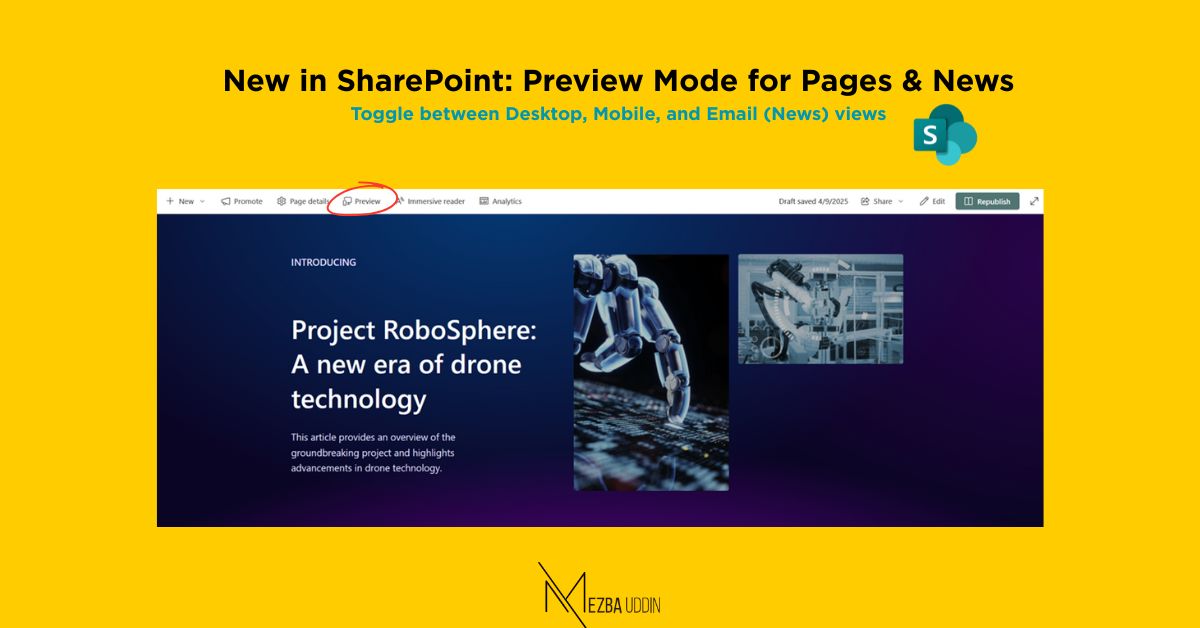
Microsoft is continuously improving SharePoint to help creators build stunning, responsive, and user-friendly content. One of the latest enhancements to support this vision is the Preview mode for SharePoint Pages and News. This new feature is now rolling out and empowers content authors to preview how their content appears across different devices, ensuring an optimal experience for every reader.
Whether you’re building an internal landing page or sharing a news announcement across your organization, Preview mode ensures you’re confident in your content before publishing.
Preview Mode for Pages and News
Preview mode is a new capability added to SharePoint Pages and News that lets content authors visualize how their page or news post will appear on different devices—desktop, mobile, and even email views (for news posts).
It’s an intuitive experience designed to simulate how end-users will see your content once published. While in Preview mode, you won’t be able to edit the page. It’s strictly for reviewing purposes, making it a safe space to validate layout, design, and formatting.
How to Enter Preview Mode
Getting into Preview mode is as simple as clicking a button:
- Go to your SharePoint Page or News post in Edit or View mode.
- Look for the “Preview” button on the command bar -> Click.
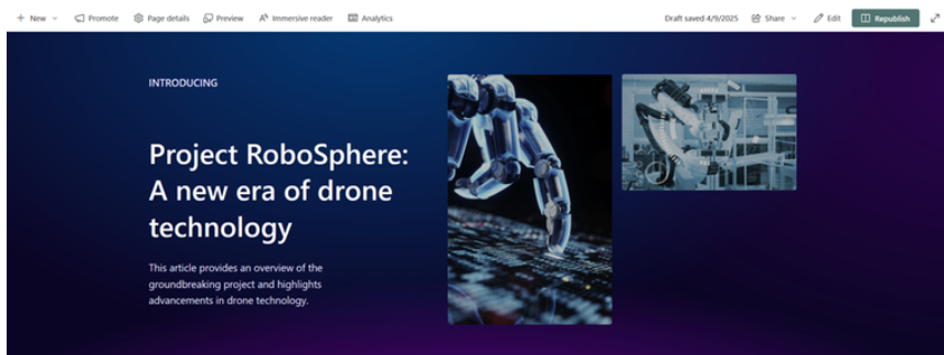
You’ll now be able to explore how your content adapts to different screen sizes.
Switching Views: Desktop, Mobile, and Email
The power of Preview mode lies in its multi-view simulation:
- For SharePoint Pages: You can toggle between Desktop view and Mobile view.
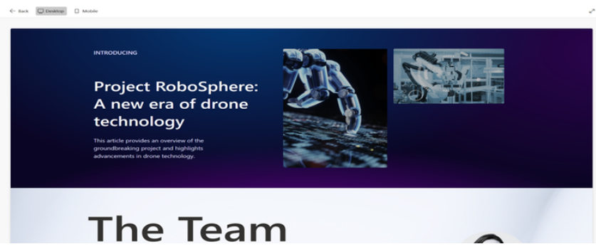
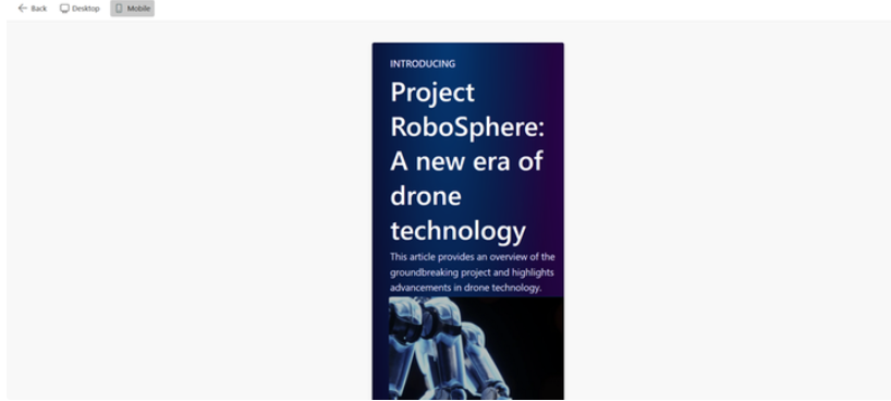
- For News posts: In addition to Desktop and Mobile, you get an extra view – Email. This lets you see how the news post would appear if shared via email, which is incredibly useful for organizations that use SharePoint news as a communication channel.
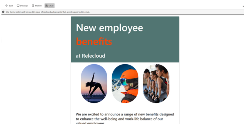
This functionality eliminates the guesswork and ensures that your audience enjoys a seamless experience—regardless of the device they use.
Customizing Mobile Views for Flexible Sections
If you’re using flexible sections in your layout, Preview mode becomes even more valuable.
Authors can now:
- Reorder how web parts reflow on mobile using the section properties pane.
- Group web parts to control their behavior on smaller screens. Grouped web parts will maintain their order and placement during reflow (from top-to-bottom or left-to-right).
This is a great step toward mobile-first design in SharePoint and gives authors more control over their content’s layout and storytelling.
Animations Come to Life
In addition to layout previews, Microsoft is also rolling out animation effects for select web parts:
- People
- Quick Links
- Editorial Cards
These web parts will slide into view when they enter the user’s viewport, adding a subtle, polished visual appeal.
- Animations are on by default.
- If needed, you can disable animations from the web part properties pane.
Even better? You can see the animation effects in action within Preview mode, helping you decide what works best for your content’s tone.
What’s Next?
Microsoft has hinted at even more enhancements on the horizon:
“We are considering additional user customization for mobile view – more details on this later.”
This shows a continued commitment to empowering content authors and embracing mobile-first experiences in SharePoint.
Wrapping Up
Preview mode is a small but mighty upgrade for SharePoint content creators. It brings confidence, consistency, and polish to every page and news post. Whether you’re showcasing a team update or rolling out a new initiative, you now have a powerful new lens to ensure it looks great everywhere.

